Software documentation is part of accessibility
How to create accessible technical documentation
We mostly discuss accessibility as a way to enable people with disabilities to use a website or application. However, the accessibility needs of users who don't have any disabilities but experience other kinds of hardships are less widely discussed.
The lack of knowledge on a given subject is such a hardship. Providing technical documentation that addresses this problem is also an essential part of accessibility, especially in the case of open-source development. Here, users don't only act as end-users but also might want to contribute to the code as developers.
If you have ever had to use poorly documented software you know what I'm talking about. Boring, badly structured, and user-hostile documentation can make people give up on a tool, just like an overly complicated purchasing process can result in shopping cart abandonment on eCommerce websites.
Two types of technical documentation
Essentially, there are two types of technical documentation:
- documentation created for end-users
- documentation created for developers
End-user documentation
Companies tend to focus more on end-user documentation. You can find nice and user-friendly examples of this kind of docs. However, even the best-designed end-user docs might lack crucial accessibility features such as sufficient color contrast or closed captioning.
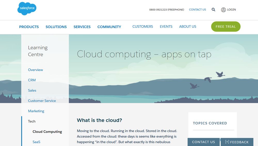
For instance, have a look at Salesforce's Learning Centre. Overall, they did a great job with the docs. The information is well-structured and logical, and the docs don't use too much technical jargon.
However, if you take a closer look you will find that some crucial accessibility features are missing. For example, links are distinguished only by color rather than providing a non-color designator such as an underline.

Developer documentation
Most technical documentation created for developers had been in a poor state for many years. They didn't simply lack accessibility features but also used unstructured text blocks, unreadable fonts and small line height, lacked table of contents, and were visually unappealing on the whole.
The rise of video tutorials made the scene of developer docs much better. At about the same time, well-designed documentations began to appear.
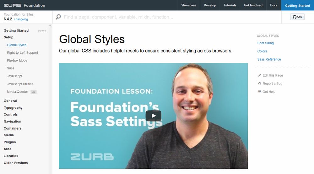
The first developer documentation I really liked was the Zurb Foundation Docs. It has improved a lot since I first saw it, but even the earlier versions were designed, written, and structured in a way that made me want to learn.

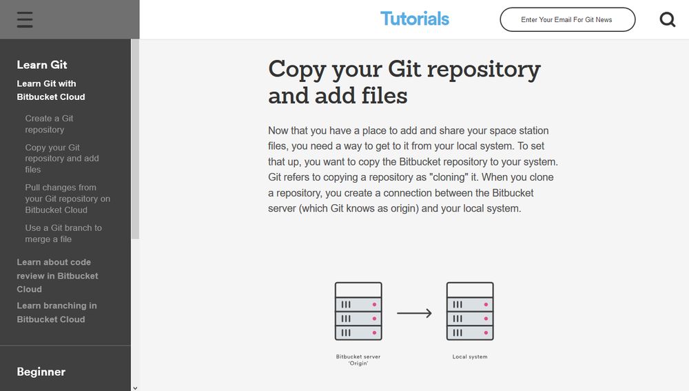
Atlassian's Git Tutorials constitute another good example of user-friendly developer documentation. They are just as well-structured as the Foundation Docs but also come with great explanatory illustrations (in SVG!) and a downloadable cheatsheet.

Both Foundation Docs and Git Tutorials present the information in a way that is accessible to users without much knowledge on the subject. Still, both have some accessibility issues that might be a problem for users with disabilities (e.g. color contrast problems).
Two levels of documentation accessibility
Documentation accessibility has two levels that both end-user and developer docs should implement:
- The docs to be accessible for users without sufficient knowledge of the tool.
- The docs to be accessible for users who may have different disabilities.
The two levels can also intersect, as there can be users who are affected by both problems (i.e. don't have the sufficient knowledge plus have a disability).
The three examples I mentioned in this article (Salesforce, Foundation, Atlassian) handle the first level of documentation accessibility really well, as they:
- don't use technical jargon, or if they do they give the necessary explanation,
- provide menus/widgets/table of contents to ease navigation,
- structure pages (careful typography, enough white space, vertical rhythm, etc.),
- provide illustrations or instructional videos,
- provide examples of usage, demos, or code snippets.
They also partially implement the second level of accessibility. However, you can still find issues here and there, such as color contrast, link visibility, or video captioning.
Wrapping up
I don't know if perfectly accessible docs exist or not, but if they do they should implement both levels of documentation accessibility. It's certainly not something easy to accomplish, as there are so many things to pay attention to.
However, documentation accessibility is still an important part of accessibility. First, because users with disabilities shouldn't be excluded from adopting new technologies, but also because it greatly impacts how many people are willing to go the extra mile to pick up a new tool.